
Visual Clarity for Digital Excellence: The Essential Guide to Quality Assurance Iconography
Understanding the Silent Language of Quality Assurance
In the fast-paced world of software development and digital product design, communication is everything. Whether you are a project manager overseeing a complex integration, a developer fixing a stubborn bug, or a designer perfecting a user interface, the ability to convey complex ideas instantly is a superpower. This is where the concept of Quality Assurance (QA) meets the power of visual design. While QA is often associated with the technical process of testing software, it is also a philosophy of trust, reliability, and user satisfaction. To represent these abstract concepts effectively, professionals rely on high-quality iconography.
Icons are the universal shorthand of the digital age. They break down language barriers, speed up cognitive processing, and add aesthetic value to otherwise sterile interfaces. When it comes to QA, icons serve a dual purpose: they guide the user through an application, and they help internal teams visualize the status of a project. From a simple "checkmark" indicating a passed test to a complex "cogwheel" representing system settings, these small graphical elements carry the weight of significant meaning.
The Role of Visuals in Modern QA Workflows
Why are icons so critical in the context of Quality Assurance? The answer lies in cognitive load. In a typical QA dashboard or a mobile testing application, users are bombarded with data—test scripts, analytics, performance metrics, and error logs. Text-heavy interfaces are exhausting to navigate. Icons provide immediate visual cues that help users locate information faster.
Consider the concept of a release cycle. This involves multiple stages: development, testing (QC), bug fixing, user acceptance testing (UAT), and final deployment. A well-designed icon set can visually narrate this journey. An icon representing a Bug Problem immediately alerts a developer to an issue, while an Approved or Certification icon signals that the software is ready for the market. These visuals transform raw data into a story of progress and stability.
Bridging the Gap Between Developers and Stakeholders
One of the most common challenges in software development is the communication gap between technical teams and non-technical stakeholders. A developer might understand the severity of a "critical error in the backend integration," but a business executive might not grasp the urgency until they see a visual indicator of failure. Using distinct icons for Rejected, Error, or Troubleshooting helps bridge this gap, ensuring everyone is aligned on the project's health.
Anatomy of a High-Functioning QA Icon Set
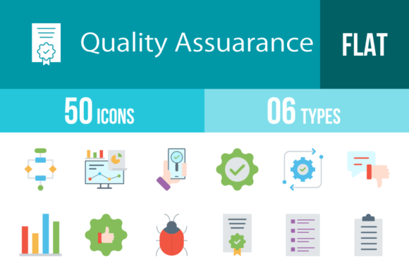
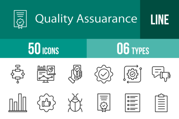
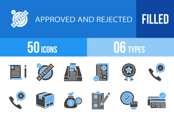
Not all icons are created equal. For a set to be truly useful in a professional environment, it must adhere to strict design principles. A robust collection, such as a set featuring 50 distinct QA symbols, is built upon a foundation of consistency and versatility. Here is what makes a QA icon set professional-grade:
- The Unigrid System: This is a design methodology where every icon is designed within a specific grid structure. This ensures that a "Laptop" icon aligns perfectly with a "Phone" or "Clipboard" icon in terms of size, stroke weight, and visual balance. Consistency is key to a professional look.
- Vector Scalability: QA assets are used in various contexts. You might need a tiny icon for a mobile app navigation bar, and a massive version for a presentation slide. Vector formats (like SVG, AI, and EPS) allow designers to scale the graphics infinitely without losing quality or becoming pixelated.
- Contextual Relevance: The icons must accurately represent the concept. For example, an icon for Security or Virus Scan should look distinctly different from an icon for Settings or Update, even if they both involve "technical" imagery.
Decoding the Symbols: Essential QA Concepts Illustrated
A comprehensive QA icon library covers the entire lifecycle of product development. Let’s explore how specific icons map to critical stages of this process, providing clarity for users and designers alike.
1. The Development and Testing Phase
The initial stages of creation require tools for organization and scrutiny. Icons in this category focus on the act of building and checking.
- Clipboard & Checklist: These are the backbone of QA. They represent the test cases, the requirements, and the step-by-step verification process. A Checklist icon implies order and thoroughness.
- Tester & App Testing: These icons often depict a person with a magnifying glass or a device with a question mark. They represent the human element of QA—the manual effort required to ensure an app functions correctly.
- Scripts & Automated: As technology advances, manual testing is often supported by automation. Icons representing Scripts or Automated processes usually feature play buttons or robotic elements, symbolizing efficiency and speed.
- Bug Problem: The universal symbol for a glitch. This icon is essential for dashboards that track error rates.
2. Performance and Analytics
Once the software is running, the focus shifts to how well it performs. This is where data visualization becomes crucial.
- Bar Graph & Analytics: These icons represent the measurement of success. They are used in reports to show traffic, load times, and user engagement. They help answer the question: "Is the software performing as expected?"
- Performance & Routine: Icons depicting speedometers or clock cycles suggest the efficiency of the system. A Routine icon might look like a cycle or loop, representing scheduled maintenance or regular checks.
- Laptop & Phone: In today's multi-platform world, QA must happen across devices. These icons ensure users understand that the product is tested for both desktop and mobile environments.
3. Trust, Security, and Release
The final hurdle in QA is ensuring the product is safe, secure, and ready for the public. This stage is about building confidence.
- Certification & Guarantee: These are badges of honor. They signal that the product has met specific standards. They are often used in marketing materials to build Trust with the end-user.
- Virus Scan & Secret: Security is a major component of quality. Icons representing a shield or a lock indicate that the software is free from malware and that user data is protected.
- Release & Update: The cycle never truly ends. The Release icon (often a rocket or a cloud upload) signifies deployment, while the Update icon (often circular arrows) represents ongoing maintenance and improvement.
- Approved vs. Rejected: These binary icons are the ultimate verdict of the QA process. They are clear, unmistakable, and vital for status boards.
Practical Applications: Where to Use These Icons
The versatility of a high-quality vector icon set means it can be deployed almost anywhere. Understanding the "where" helps maximize the value of the asset.
Mobile and Web Interfaces
For UX/UI designers, these icons are building blocks. A Customer support section of an app might use the Service or Communication icons. A settings menu naturally utilizes the Cogwheel or Settings icon. Using consistent icons improves the Usability of the product, making it intuitive for users to navigate without reading lengthy instructions.
Corporate Presentations and Reports
When presenting a quarterly QA report to stakeholders, a slide filled with text is a recipe for boredom. By replacing bullet points with icons like Analytics, Improvement, and Decision, the presenter creates a visual narrative. It makes the data more digestible and the presentation more engaging.
Print and Documentation
Technical writing and user manuals benefit greatly from iconography. A warning symbol next to a Troubleshooting section or a Clipboard icon next to a setup guide helps readers scan the document quickly to find the information they need.
The Technical Edge: Formats and Editability
A professional icon set is not just a collection of pictures; it is a toolkit. The value of the toolkit lies in its adaptability. A set that offers multiple formats—such as AI, CDR, EPS, JPG, PNG, and SVG—provides a solution for every technical requirement.
- SVG (Scalable Vector Graphics): The gold standard for web development. SVGs are lightweight and can be manipulated with code (CSS), allowing developers to change colors or sizes dynamically.
- AI & EPS (Vector Formats): Essential for graphic designers using Adobe Illustrator or CorelDRAW. These formats allow for deep editing of the icon paths.
- PNG (Portable Network Graphics): Necessary for environments where vector editing isn't possible or for quick drag-and-drop usage. Having multiple sizes (e.g., 20 different PNG sizes) ensures that the icon looks crisp whether it is 16x16 pixels or 512x512 pixels.
Conclusion: Elevating Quality Through Design
Quality Assurance is fundamentally about attention to detail. It is the rigorous process of ensuring that a product works flawlessly, looks professional, and meets the user's needs. Ironically, the tools used to represent QA—namely, the icons—must also meet these same high standards.
By utilizing a comprehensive, well-designed set of QA icons, teams can improve communication, streamline workflows, and enhance the visual appeal of their digital products. Whether you are indicating a Good Quality result, managing a Survey, or configuring Software, the right icon ensures your message is understood instantly. In the end, great quality assurance is not just about finding bugs; it is about building a seamless experience from start to finish, and these visual tools are an indispensable part of that journey.
