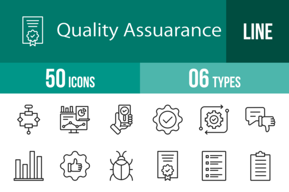
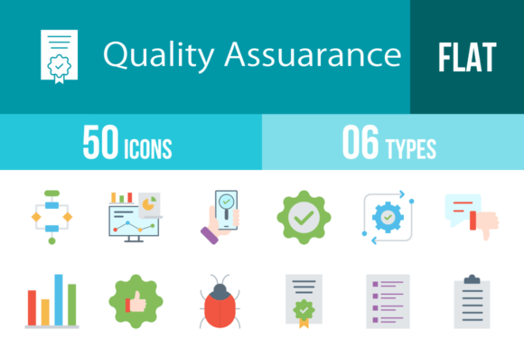
50 Quality Assurance Line Icons for Modern Design
In the world of digital and print design, visual communication needs to be instant and unmistakable. Whether you're building a complex SaaS dashboard, a mobile application, or a corporate presentation, the ability to convey concepts like "testing," "approved," or "bug fix" without cluttering the screen is invaluable. This is exactly where a robust set of 50 Quality Assurance Line Icons becomes a cornerstone of your design assets. These icons are not just simple drawings; they are a cohesive visual language designed to bridge the gap between technical functionality and user-friendly aesthetics.
A Visual Language for Tech and Business
The primary strength of this collection lies in its personality. It avoids the heavy, blocky aesthetic of older icon sets in favor of a modern, minimalist line style. This approach aligns perfectly with contemporary web design and UI/UX trends, where clarity and white space are king. The icons possess a clean, professional neutrality, making them suitable for serious corporate environments while remaining friendly enough for consumer-facing apps.
Visually, the set is built on a unigrid system. This is a critical detail for designers who value precision. A unigrid ensures that every icon—whether it is the Algorithm, Analytics, or App Testing—occupies a consistent visual weight and aligns perfectly within a layout. This consistency is the hallmark of professional brand identity work. It prevents the "patchwork" look that often happens when mixing icons from different sources. The lines are balanced, the curves are smooth, and the negative space is optimized to ensure legibility at both large display sizes and small interface footers.
Practical Applications Across Industries
While the name suggests a focus on software testing, the utility of these 50 Quality Assurance Line Icons extends far beyond the development team. For marketers and entrepreneurs, these symbols are essential for storytelling. Consider a pitch deck or a presentation: using icons like Performance, Growth, or Guarantee helps break up dense text and guides the audience's eye to key metrics. In editorial design and blogging, icons such as Survey, Checklist, and Clipboard can visually anchor a listicle or a how-to guide, increasing reader engagement and retention.
For mobile apps and software interfaces, the icons serve as functional wayfinding tools. The Settings cogwheel, the Update arrow, and the Notification bell are universal, but having them in a matched set ensures your UI looks polished. Small business owners will find them particularly useful for packaging design or instructional materials. For instance, a hardware brand could use the Repair and Routine icons on their packaging to clearly explain maintenance steps, adding a layer of professionalism that builds consumer trust.
Flexibility and File Formats
A major hurdle in design workflows is compatibility. You often find the perfect icon only to realize it’s a low-resolution JPG that looks blurry on a retina screen. This collection solves that problem by offering 6 different formats: AI, CDR, EPS, JPG, PNG, and SVG.
- SVG (Scalable Vector Graphics): This is the gold standard for web design. SVGs are code-based, meaning they load instantly and look crisp on any screen size without increasing file weight. They are perfect for responsive websites and mobile apps.
- AI, CDR, EPS: These are vector formats essential for graphic designers. They allow you to open the icons in Adobe Illustrator or CorelDRAW to change colors, stroke weights, or combine elements. This "easy to edit" feature means you can tailor the icons to match specific brand identity guidelines.
- PNG: For those who need quick assets for social media or presentations, the set includes 20 PNG sizes. This ensures you have the exact pixel dimension needed, whether it's for a tiny favicon or a large hero image.
Furthermore, the inclusion of specific icons like UX, Virus Scan, and End To End demonstrates a deep understanding of the subject matter. It’s not just generic clip art; it is a specialized toolkit for the tech and QA industry. The Customer and Satisfaction icons also bridge the gap to customer service departments, making this a versatile asset for HR and support teams creating internal wikis or training manuals.
Integrating Icons into Your Design Strategy
When incorporating these icons into your projects, think about visual hierarchy. Because they are line icons, they work best when they have room to breathe. Avoid placing them on busy, patterned backgrounds. Instead, use solid colors or subtle gradients. A common mistake is mixing icon styles—using a flat icon here and a 3D icon there. By standardizing your assets with this 100 vector icons set, you maintain a cohesive aesthetic that signals competence to your audience.
For print applications, such as brochures or business cards, the high-resolution vectors ensure that the edges remain sharp even when printed on textured paper. The Certification and Approved stamps are particularly effective for adding a "seal of quality" to physical products or official documents.
Ultimately, the value of the 50 Quality Assurance Line Icons lies in their ability to communicate complex ideas simply. Whether you are a designer building a dashboard, a blogger illustrating a tutorial, or an entrepreneur crafting a pitch, these icons provide the visual shorthand needed to make your message understood. They are designed for maximum usability, ensuring that your projects not only look good but also function effectively for the end-user.
