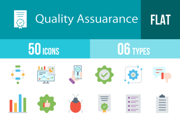
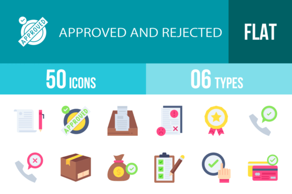
50 Quality Assurance Flat Multicolor Icons for Professionals
In the fast-paced world of software development and product management, visual communication is not just a luxury; it is a necessity. Whether you are drafting a technical specification, designing a user dashboard, or presenting a quarterly report to stakeholders, the ability to convey complex processes quickly is vital. This is where a dedicated set of 50 Quality Assurance Flat Multicolor icons becomes an indispensable asset. These icons are not merely decorative elements; they are functional tools designed to bridge the gap between technical jargon and visual understanding, specifically tailored for the rigorous demands of QA and software testing.
Beyond Basic Aesthetics: The Unigrid System
When evaluating icon sets, consistency is often the first casualty. Many free resources suffer from mismatched line weights, varying perspectives, and disjointed color palettes. The 50 Quality Assurance Flat Multicolor collection avoids this pitfall by utilizing a strict unigrid system. This design framework ensures that every icon—from the "Bug Problem" to the "Certification" badge—occupies the same visual weight and spatial footprint.
For the end user, this translates to a professional polish that is hard to achieve otherwise. When you place the "Approved" icon next to the "Rejected" icon in a status report, they look like they belong together. The flat multicolor style is particularly effective here; it provides enough visual distinction to differentiate categories (e.g., red for errors, green for success, blue for settings) without the distraction of heavy gradients or 3D effects that can look dated on modern, high-resolution screens.
Technical Flexibility for Modern Workflows
One of the most common frustrations for designers and developers is format incompatibility. You find the perfect icon, only to realize it is a low-resolution JPG that pixelates the moment you try to resize it. The 50 Quality Assurance Flat Multicolor package addresses this by offering six distinct formats: AI, CDR, EPS, JPG, PNG, and SVG.
- Vector Formats (AI, EPS, CDR, SVG): These are crucial for scalability. Whether you are printing a massive banner for a tech conference or scaling down for a mobile app interface, vector formats ensure the lines remain crisp. The SVG format is particularly useful for web developers looking to implement lightweight, scalable graphics that load faster than image files.
- Raster Formats (PNG, JPG): With 20 different PNG sizes included, the set caters to immediate needs. You don't need to open Illustrator to resize an icon for a PowerPoint slide; you simply grab the appropriate pixel dimension. This "ready to use" approach saves significant time during the production phase.
Practical Applications Across Industries
While the set is named for Quality Assurance, its utility extends far beyond the QA department. The visual language of testing, feedback, and improvement is universal in business. Here is how different professionals can leverage these assets:
For Product Managers and Developers
Visual clutter is the enemy of good UI design. When building internal dashboards or customer-facing status pages, you need icons that communicate status instantly. The "Performance" and "Analytics" icons can break up walls of text in a user interface. Furthermore, during the onboarding process for new software, using the "Tutorial" or "Questionnaire" icons can guide users through complex setups without overwhelming them with instructions.
For Educators and Trainers
Teaching coding, project management, or business analysis requires clear visual aids. The "Checklist," "Clipboard," and "Algorithm" icons are perfect for slide decks and worksheets. They help students visualize abstract concepts. For instance, using the "End To End" icon can help illustrate the lifecycle of a software sprint, making the learning process more engaging and less abstract.
For Marketers and Content Creators
Even in content marketing, the 50 Quality Assurance Flat Multicolor set has a place. Blog posts about "Top 10 Website Bugs to Avoid" or "How to Improve Your App’s UX" become much more readable when broken up by relevant imagery. The "Trust" and "Guarantee" icons are excellent for e-commerce landing pages, visually reinforcing security and reliability to potential customers.
Key Features That Drive Efficiency
The true value of this icon set lies in its usability features. It is designed not just to look good, but to work hard.
- Comprehensive Vocabulary: The set covers a specific semantic field that generic icon packs miss. You will find niche terms like "Regression," "Scripts," and "Troubleshooting" represented visually. This specificity eliminates the need to improvise with unrelated imagery.
- Editability: Because the icons are 100% vector-based, they are fully editable. If your brand color is a specific shade of teal rather than the default blue, you can easily change the fill color in your vector editor. This ensures the icons integrate seamlessly with your existing brand identity.
- Cross-Platform Consistency: The design is optimized for all devices. Whether viewed on a Retina display, a standard monitor, or printed in a physical manual, the clarity is maintained. This is essential for businesses that operate across multiple touchpoints.
Real-World Use Cases and Observations
Consider a scenario where a development team is using Jira or Trello to manage their sprints. Standard column headers like "To Do," "In Progress," and "Done" can be enhanced with the "Execution," "WIP," and "Approved" icons. This not only adds color to the board but allows team members to scan the status of the project at a glance.
Another practical application is in the creation of Standard Operating Procedures (SOPs). When documenting the "Release" process or "Integration" testing phases, pairing text instructions with the corresponding icons reduces cognitive load. It turns a dry document into a visual guide that is easier to follow and less prone to user error.
Selecting and Implementing Your Icons
When incorporating the 50 Quality Assurance Flat Multicolor icons into your workflow, keep a few best practices in mind to maximize their impact:
- Maintain Context: While the icons are distinct, ensure they are used in context. The "Virus Scan" icon should be used for security contexts, not just generic "checking." Semantic accuracy builds user trust.
- Balance with White Space: Flat design thrives on clean layouts. Avoid crowding the icons with other visual elements. Give them room to breathe so the multicolor elements stand out against the background.
- Consistency in Sizing: Even though the set offers multiple sizes, try to stick to one or two specific sizes within a single document or interface to maintain a clean grid structure.
Ultimately, this collection is about removing friction from the design and communication process. By providing a robust, versatile, and professionally designed toolkit, it allows creators to focus on what matters: building better products, clearer documentation, and more effective presentations. It is a small investment that yields significant returns in clarity and professionalism.