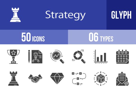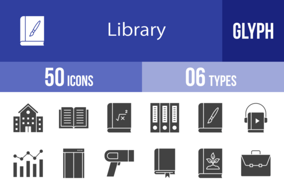
Streamlining Visual Communication with 50 Library Glyph Icons
The Foundation of a Unified Design System
In the landscape of digital and print design, consistency is the bedrock of professionalism. When you are building a mobile app, drafting a presentation, or setting up a corporate website, the visual language you use dictates how users perceive your credibility. The 50 Library Glyph Icons set is designed specifically to solve the fragmentation problem that occurs when assets are sourced from different places. Instead of mixing styles that clash, this collection provides a cohesive visual vocabulary based on a unigrid system. This ensures that every icon, from the Open Book to the Departure sign, shares the same visual weight, optical alignment, and geometric structure. By utilizing a standardized set, you eliminate the guesswork in spacing and sizing, allowing the content to take precedence while the interface remains intuitive.
Understanding the Asset Structure and Formats
One of the primary bottlenecks in any design or development workflow is asset conversion. You often receive a file in one format but need it in another to make it work with your specific software. This library eliminates that friction by providing 6 different formats: AI, CDR, EPS, JPG, PNG, and SVG.
- Vector Formats (AI, CDR, EPS, SVG): These are essential for the planning and design phase. If you are using Adobe Illustrator or CorelDRAW, you can manipulate the anchor points of the Algebra icon or the Bar Graph to match a specific brand color palette. SVGs are particularly critical for modern web development, offering crisp rendering on any screen resolution without increasing file size.
- Raster Formats (JPG, PNG): These are the workhorses of implementation. The inclusion of 20 different PNG sizes (ranging from 16×16 to 72×72 and beyond) means you do not need to manually resize assets for different contexts. A 16×16 icon is perfect for a favicon or a dense data table, while a 64×64 or larger version is suitable for mobile app interfaces or presentation slides.
This comprehensive format availability ensures that whether you are a developer working in code or a marketer working in PowerPoint, the assets are immediately deployable.
Integration into Workflow: From Concept to Execution
Effective project management involves matching the right asset to the right stage of the process. The 50 Library Glyph Icons are not just decoration; they are functional tools for information architecture.
Early Stage: Wireframing and Prototyping
During the wireframing stage of a website or app, clarity is more important than aesthetics. You need to indicate where a Calendar, Chat, or Download function will be located. Using these glyph icons early in the process helps stakeholders understand the user journey without getting distracted by high-fidelity design elements. The Browser and Folder icons, for example, can quickly map out a file management system’s logic before a single line of code is written.
Mid-Stage: Content Creation and Presentation
For educators and business professionals, the presentation phase is where information must be digested quickly. Text-heavy slides reduce retention. By pairing bullet points with relevant icons—such as using the Chemistry icon for science topics or the Currency icon for financial reports—you create visual anchors. This is particularly useful for print materials and templates where white space is limited. The icons serve as visual punctuation, guiding the reader's eye through the hierarchy of information.
Final Stage: User Interface (UI) Implementation
In the final product, usability is paramount. The 50 Library Glyph Icons are designed for maximum legibility at small sizes. Consider the Identification Card icon for a profile section or the Exit icon for a logout function. These need to be recognizable instantly. Because the set is designed using a unigrid system, you can place the Bookmark icon next to the Calendar icon, and they will sit perfectly on the same horizontal line without optical illusions causing one to look larger than the other.
Diverse Use Cases Across Industries
The utility of a generic library is often limited, but the thematic diversity of this set—covering everything from Botany to Business—makes it adaptable to various sectors.
- Travel and Logistics: For apps or websites dealing with movement, the Boarding Gate, Departure, Flight, Directions, and Delivery Truck icons provide an immediate visual shorthand for complex logistics chains.
- Education and Publishing: Content creators can utilize the Audiobook, Literature, Comic Book, and Music Book icons to categorize different media types in a digital library interface.
- Corporate and HR: Internal tools often require specific iconography. The Interview, Certificate, Clipboard, and Important Topics icons are ideal for internal wikis, employee handbooks, or recruitment portals.
Optimizing for Performance and Scalability
A common mistake in web design is using oversized assets that slow down page load times. The 50 Library Glyph Icons address this by offering a granular range of sizes. When optimizing a mobile app, you should select the smallest viable PNG size (like 29×29 or 32×32) to ensure the interface feels snappy. Conversely, for illustration or large-format printing, the vector formats allow you to scale the Globe or Hand Over icons to billboard size without pixelation.
Furthermore, the "Easy to edit" nature of the vector files means you can streamline your asset management. Instead of storing ten different color variations of the Browser icon, you store one master file and change the color code upon export. This reduces repository bloat and makes version control significantly easier for teams.
Maintaining Consistency in Multi-Platform Environments
Modern projects rarely live on just one platform. You might launch a campaign that requires a website, a mobile app, and a printed brochure. Using disparate icon sets for each medium creates a disjointed brand experience. By relying on the 50 Library Glyph Icons for all three, you ensure that the Calendar looks the same on an iOS app as it does on a printed flyer. This cross-platform consistency builds trust with the audience, as the visual language remains stable regardless of the device or medium they are using.
Ultimately, the value of this icon set lies in its ability to remove friction from the creative and technical process. By providing a robust, scalable, and versatile toolkit, it allows professionals to focus on the message and the user experience, rather than spending hours hunting for or modifying disparate assets. Whether you are mapping out a global logistics network or designing a local community newsletter, these glyphs provide the visual infrastructure needed to communicate clearly and effectively.