Streamlining Visual Communication: A Practical Guide to Using 50 Health Checkup Filled Line Icons
In the fast-paced world of digital content and application development, clarity is not just a luxury; it is a requirement. Whether you are designing a patient portal for a hospital, creating a presentation for a pharmaceutical company, or building a fitness tracker app, visual cues determine how quickly a user understands a concept. Text-heavy interfaces lead to cognitive overload, while clear iconography allows for rapid scanning and comprehension. This is where a comprehensive asset library, specifically a set of 50 Health Checkup Filled Line Icons, becomes an essential component of your design toolkit.
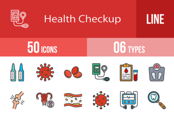
These icons are not merely decorative elements; they are functional tools designed to bridge the gap between complex medical terminology and user understanding. The set includes a wide array of specific symbols, ranging from clinical equipment like the Blood Pressure Gauge and Stethoscope to biological elements like Bacteria and Blood Cells. By utilizing a standardized set, you ensure that your visual language remains consistent across mobile apps, websites, print materials, and presentations.
The Foundation of Usability: The Unigrid System
Before integrating these assets into a project, it is crucial to understand the design philosophy behind them. These icons are designed using a unigrid system. In practical terms, this means every icon adheres to a strict mathematical framework regarding size, stroke weight, and padding. When you place the Lungs icon next to the Heart Rate icon, they will align perfectly. There is no need for manual adjustments to make them look "even."
This consistency is vital during the execution phase of a project. When developers are coding a responsive layout, assets that behave predictably save hours of debugging and CSS adjustments. The filled line style ensures that the icons are legible even at small sizes, which is particularly important for mobile interfaces where screen real estate is limited. Whether you are viewing the Medical App icon on a 4-inch smartphone screen or a 27-inch monitor, the visual weight remains balanced.
Pre-Production: Planning Your Visual Language
Effective implementation begins with planning. Before you drag and drop the Doctor or Nurse icons into your design, you should map out your user journey. Consider the flow of information in a health-related project. For instance, if you are building a telemedicine platform, the user journey might look like this:
- Onboarding: Use the Smartwatch or Medical Folder icons to represent data syncing and profile creation.
- Symptom Checking: Here, specific icons like Ear, Eye Examination, or Dental Checkup allow users to quickly identify their area of concern.
- Consultation: The Phone Call or Speech Bubble icons guide the user to the communication interface.
- Post-Visit: Use Prescription, Medical Report, and Pharmacy related icons to direct users to their next steps.
By planning the placement of these icons early, you create a cohesive narrative. You are not just adding images; you are guiding the user through a process. This proactive approach prevents the "visual clutter" that often plagues health-related interfaces.
Technical Integration and Workflow Efficiency
One of the standout features of this icon set is its versatility across file formats. The package includes AI, CDR, EPS, JPG, PNG, and SVG files. Understanding which format to use for which stage of your workflow is key to efficiency.
For web and mobile development, SVG (Scalable Vector Graphics) is the industry standard. SVGs are code-based, meaning they load instantly and can be scaled to any size without pixelation. This is perfect for the Coronavirus or Vaccine icons which might need to be enlarged for informational infographics. Furthermore, SVGs allow you to change the color of the icon using simple CSS, enabling you to adapt the Defibrillator icon to match your brand’s specific hex code in seconds.
For print materials—such as brochures for a clinic or flyers for a Diet plan—the EPS or AI formats are superior. These vector formats ensure that the X Rays or Sonography icons print with crisp, sharp edges, regardless of the paper size. If you are working in Adobe Illustrator, you can easily edit the anchor points to customize the icons further, perhaps adding a small detail to the Hospital icon to match a specific architectural style.
The PNG format, with its transparent background, is ideal for quick mockups, presentations in PowerPoint or Keynote, and use in drag-and-drop website builders. If you need to quickly illustrate a slide about Cholesterol or Diabetes Test results, a high-resolution PNG is the fastest route to a polished look.
Practical Use Cases Across Industries
The utility of these health checkup icons extends far beyond traditional medical settings. Here is how different professionals can integrate them into their workflows:
For Educators and Bloggers
If you are writing a series of articles on preventative health, visual breaks are essential for reader retention. Using the Water Bottles icon in a section about hydration or the Dumbbell icon in a fitness segment helps break up the text. It signals to the reader what the paragraph is about before they even read the first word. For educators creating worksheets, the Microscope or Blood Test icons can serve as visual markers for different sections of an exam or study guide.
For App Developers and UI Designers
In a mobile health (mHealth) app, iconography is the primary navigation method. A bottom navigation bar might feature the Medical Appointment icon for scheduling, the Medical Report icon for history, and the Medicine icon for reminders. Because these icons are designed for maximum usability, they reduce the learning curve for the user. You don't need a label next to the No Smoking icon; the symbol is universally understood.
For Marketing and Corporate Wellness
Companies focusing on employee health can use these assets in internal communications. A presentation on Health Insurance benefits becomes much more engaging with relevant iconography. A corporate wellness portal can use the Mental Health and Body Scale icons to categorize resources. The professional aesthetic of the filled line style conveys a sense of trust and authority, which is critical when discussing health matters.
Optimizing for Performance and Scalability
When implementing the 100 vector icons provided in this pack, performance should remain a priority. While SVGs are lightweight, loading 50 individual files can create HTTP requests that slow down a website. A best practice is to use an SVG sprite sheet or an icon font. This combines all the icons—such as the Kidney, Liver, and Lungs—into a single file. The browser downloads this file once, and you can then reference specific icons throughout your site using ID tags. This method keeps your load times fast while providing access to the entire library.
Scalability is another factor. Because these assets are vector-based, they are future-proof. If you redesign your application next year and switch to a larger display format, you do not need to source new images. The Cervical Cancer awareness ribbon or the Face Mask icon can be scaled up to billboard size for a health fair banner without any loss of quality.
Ensuring Consistency in Branding
Visual consistency builds trust. If your website uses a specific style of iconography on the homepage but a completely different style in the checkout process, it creates a disjointed experience that can subconsciously erode user confidence. By committing to this single set of 50 icons, you ensure that every touchpoint—from the Smartwatch sync screen to the final Medical Checkup summary—feels part of the same ecosystem.
Moreover, the "filled line" style strikes a perfect balance. It has enough detail to be recognizable (unlike minimal line icons) but is clean enough to avoid looking cluttered (unlike fully filled pictograms). This makes the set adaptable to both light and dark mode interfaces, a common requirement in modern mobile app design.
Conclusion: A Resource for Execution
The difference between a good project and a great one often lies in the details of execution. Having access to a high-quality, versatile, and logically structured set of 50 Health Checkup Filled Line Icons removes a significant bottleneck from the design and development process. It allows you to focus on the logic of your application or the message of your content, rather than spending hours hunting for or creating basic visual assets. By integrating these icons thoughtfully, you enhance usability, improve aesthetic quality, and ultimately deliver a more professional product to your audience.