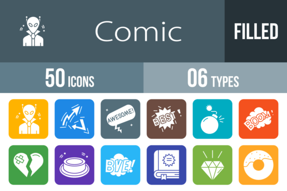
50 Comic Filled Round Corner Icons for Bold, Engaging Visuals
Why Comic Style Icons Grab Attention Instantly
In a digital landscape saturated with minimalist line icons and flat design, comic-inspired visuals cut through the noise. The 50 Comic Filled Round Corner Icons collection taps into a universally recognized visual language — one that evokes energy, emotion, and immediacy. These aren't decorative afterthoughts. They're functional design assets built to communicate ideas fast, whether you're designing a mobile app interface, building a presentation deck, or creating marketing materials that need to land with impact.
What makes comic icons particularly effective is their emotional clarity. A speech bubble with "OMG" inside it doesn't need explanation. A lightning bolt icon paired with "ZAP" carries instant meaning. This shorthand visual vocabulary has been refined over decades of comic book artistry, and now it's packaged into a modern, professional toolkit ready for real-world deployment.
What's Inside This Icon Collection
The set includes 50 distinct icons, each designed with filled shapes and rounded corners for a polished, approachable look. The roster covers a wide emotional and functional range:
- Emotion and reaction icons: Love, Like, Broken Heart, Lol, Yeah, Wow, Oops, Sorry, and Thankyou
- Communication bubbles: Hi, Bye, See You, Shh, Oh, Omg, What, Pow, Smash, Splash, Zap, and more
- Action and energy icons: Bomb, Dynamite, Rocket, Fight, Hammer, Shield, Star, Win
- Character and theme icons: Alien, Robot, Female Superhero, Super Hero, Spaceship
- Utility and symbolic icons: Envelope, Question Mark Bubble, Diamond, Rainbow, Donut, Party, Button, Dots
Each icon is built using a unigrid system, which means consistent proportions, aligned baselines, and visual harmony across the entire set. You won't end up with one icon that feels heavier or larger than another when placed side by side. This structural consistency is critical for professional projects where mismatched assets immediately signal low quality.
File Formats That Actually Work Across Workflows
One of the most practical strengths of this collection is its format versatility. The icons ship in six different file types:
- AI — Native Adobe Illustrator files for full vector editing control
- CDR — CorelDRAW compatibility for users in that ecosystem
- EPS — Universal vector format accepted by virtually every design application
- SVG — Scalable vector graphics ideal for web and app development
- PNG — Raster files with transparency for quick implementation
- JPG — Compressed files for presentations, documents, and lightweight use
This range eliminates the friction of format conversion. A freelance designer working in Illustrator can hand off SVG files to a developer building a React app. A marketing manager can drop PNG versions straight into a PowerPoint deck. A print shop can use EPS files for large-format output without quality loss. The collection respects the reality that modern projects span multiple tools, platforms, and collaborators.
Mobile App and Web Interface Design
Comic-style icons work exceptionally well in apps targeting casual, entertainment, social, or youth-oriented audiences. Think messaging apps, gaming platforms, event apps, or community forums. The 50 Comic Filled Round Corner Icons set includes reaction icons like thumbs up, hearts, and exclamation bubbles that map directly onto common UI patterns — reaction buttons, notification badges, status indicators, and onboarding screens. The rounded corners also align with modern UI conventions, reducing visual friction.
Presentations and Pitch Decks
Corporate presentations often suffer from visual monotony. Dropping a bold "POW" bubble or a rocket icon into a slide doesn't just decorate — it anchors attention and creates memorable moments. Educators and trainers can use icons like the question mark bubble to prompt discussion or the star icon to highlight key takeaways. The filled style ensures visibility even at small sizes on projected screens.
Marketing and Social Media Content
Social media thrives on visual punch. These icons can serve as standalone graphics, overlay elements on photos, or accent pieces in branded templates. A "SALE" banner paired with a bomb icon. An Instagram story featuring the "WOW" bubble. A newsletter header with the envelope and heart icons. The comic aesthetic naturally suits platforms like Instagram, TikTok, and Snapchat where personality-driven content outperforms sterile corporate visuals.
Educational Materials and Classroom Resources
Teachers and instructional designers often need visuals that are engaging without being childish. Comic icons occupy that sweet spot. They're expressive enough to capture attention but structured enough to feel professional. Worksheets, interactive PDFs, e-learning modules, and classroom posters all benefit from this kind of visual vocabulary.
Print Design and Merchandise
Because the icons are vector-based and designed for scalability, they translate cleanly onto physical products — stickers, t-shirts, greeting cards, posters, and packaging. The 100% vector foundation means no pixelation at any size, which is non-negotiable for print production.
Design Quality and Editability
Every icon in this set is 100% vector, meaning you can resize, recolor, and reshape them without degradation. Need a pink explosion instead of a yellow one? Adjust the fill color in seconds. Want to scale the rocket icon to billboard size? Vector paths handle it effortlessly. This editability extends the useful life of the collection significantly — you're not locked into one aesthetic direction.
The unigrid system also deserves emphasis. It's not just a technical detail; it's a design philosophy that ensures every icon feels like part of the same family. When you use five or six icons from the set in a single project, they'll look intentionally curated rather than cobbled together from random sources. That cohesion matters for brand perception and overall design credibility.
Choosing the Right Icons for Your Project
With 50 icons available, selection becomes a practical consideration. Here are a few approaches:
- Audience-first selection: Choose icons that match your audience's cultural familiarity. A "POW" bubble resonates broadly, but a "Shh" icon might work better in a library app than a fitness platform.
- Emotional mapping: Pair reaction icons with specific user actions. "Yeah" for successful task completion. "Oops" for error states. "Sorry" for apology flows. This turns icons into functional UX elements.
- Visual weight balancing: Some icons carry more visual energy than others. Use high-energy icons like dynamite and smash sparingly as accent pieces, while calmer icons like the envelope or diamond can serve as steady visual anchors.
- Consistency rules: Once you select a subset for a project, stick with that subset. Mixing all 50 into one interface creates visual noise. Curated restraint amplifies impact.
Final Thoughts on This Comic Icon Set
The 50 Comic Filled Round Corner Icons collection is a practical, well-structured toolkit for anyone who needs expressive, scalable, and versatile visual assets. It doesn't try to be everything — it focuses on delivering a specific aesthetic with professional-grade execution. The multi-format delivery, unigrid consistency, and full vector editability make it genuinely usable across real projects, not just impressive on a product page.
Whether you're building an app, designing a presentation, creating social content, or developing educational materials, these icons give you a visual language that's immediately recognizable and emotionally resonant. That's harder to achieve than most people realize, and having it packaged and ready to deploy saves significant design time and effort.
